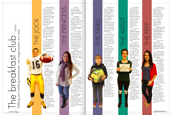
Published Organizations Spread in Vespa Yearbook - 2013. This was the first spread I ever created entirely by myself, from the copy to the design and the photographs. I had to coordinate that the students were wearing a color that would match the bar behind them. Also, I had never written a profile, let alone five. This spread allowed me to explore a different type of writing. With no knowledge of photoshop, the cut-outs posed a difficult task but I got the hang of it and the skill has served me well.
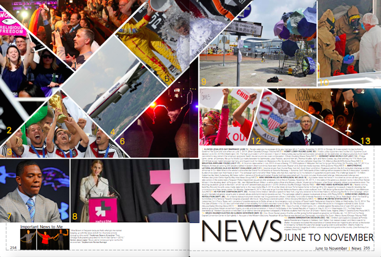
Published in Vespa Yearbook - 2015. Although I began this news spread as a timeline (like we do every year) I soon got bored and began experimenting with the pen tool to create distinct frames. Drawing upon inspiration from a Time magazine spread, I created this unconventional spread. Because our staff subscribes to a particular news photo company, I was extremely limited in my photo options and had to settle.
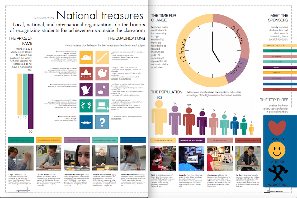
Published Organizations Spread in Vespa Yearbook - 2014. Drawing inspiration from an info graphic spread in Time magazine, I created this spread to stray from the traditional copy spreads that are made every year for honor societies. I was specifically applauded by a judge from the Columbia Scholastic Press Association.
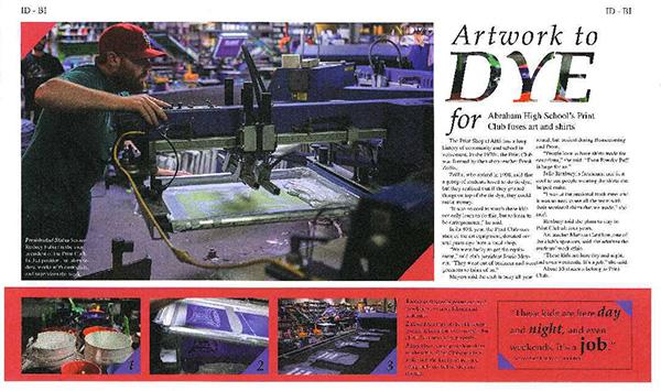
State Champion Double Page Yearbook Layout Illinois High School Association Winner - 2014. I color grabbed both the red and blue colors from swatches in the dominant photo to create a design that complimented the dominant photo. I also used my hilarious wit to create an aesthetically pleasing and clever headline. I knew not many competitors would think to use a pull-quote so I seized the opportunity.
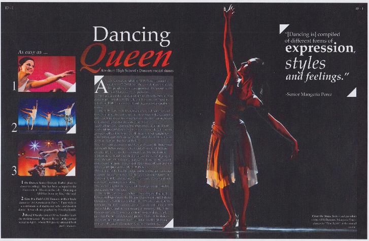
Sectional Champion Double Page Yearbook Layout Illinois High School Association Winner - 2014. In this competition, we were restricted to four fonts we could use which annoyed me because they're ugly (I hate serif font if you couldn't tell from this website.) I used kerning, tracking and scaling to better fit my vision for the fonts.
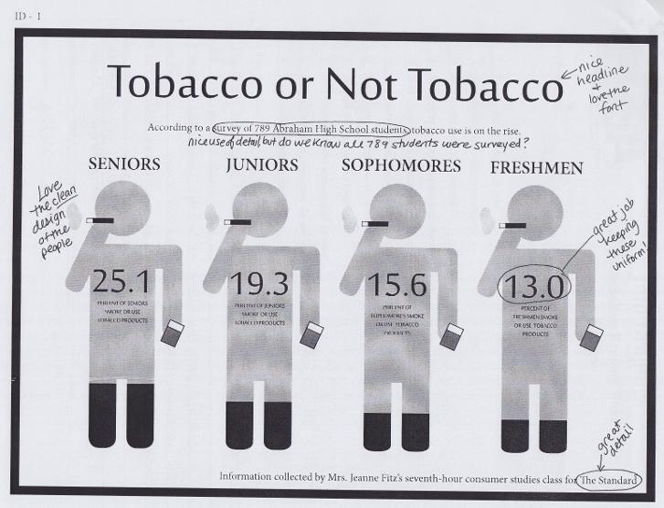
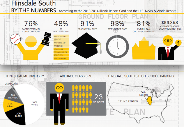
5th place Info Graphics Illinois High School Association State Winner - 2014. I tried to avoid using a pie chart because I knew every competitor would do that. Guess what won first place? A pie chart. Guess what the judge told me I should have done? A pie chart. Sigh.
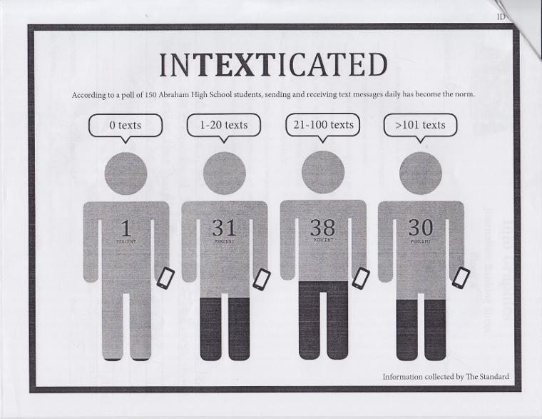
2nd place Info Graphics Illinois High School Association Sectional Winner - 2014. As my first ever journalism competition, I was nervous going into it. I finished with 45 minutes left to spare. Therefore, I over-complicated the design and the judge noted it would not look clean in print. I took this advice to State where I focused on making the design clear and readable.
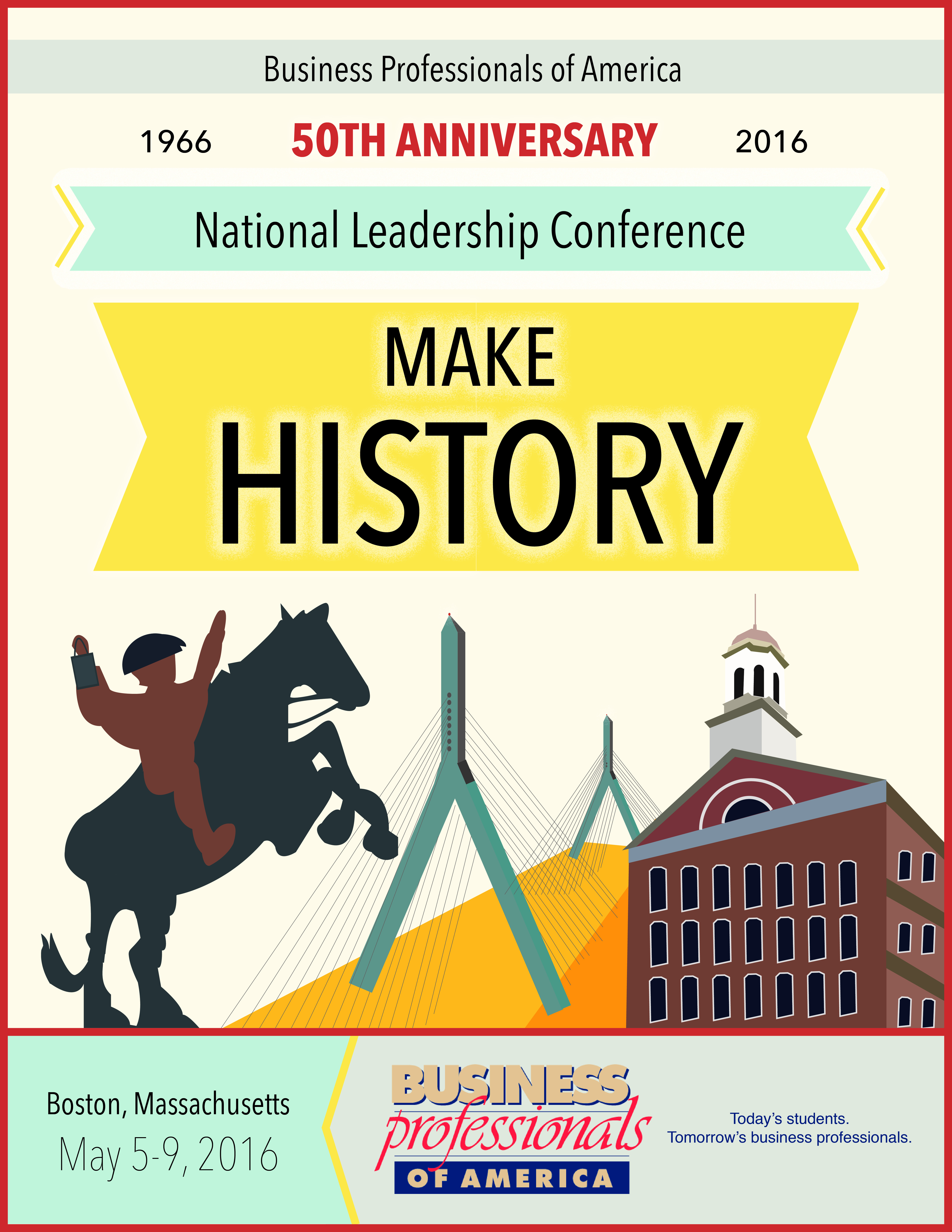
Business Professionals of America Graphic Design Promotion Regional Champion/State - 6th Place Design - 2015
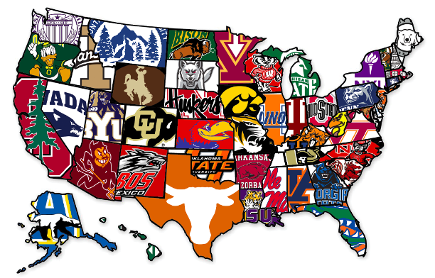
Published Academics Spread Graphic in Vespa Yearbook - 2015. This graphic took six hours and a third of my life span. I had to individually trace each state to graphically represent colleges in each state. Logos courtesy of respective colleges. I realize that there were graphics of the same idea that we could have used, but I wanted the yearbook to be as much of our work as possible.
Published Opener Spread Graphics in Vespa Yearbook - 2015. As the opening graphics to the yearbook, I wanted to give an interesting overview of the school with facts that most people would not know.
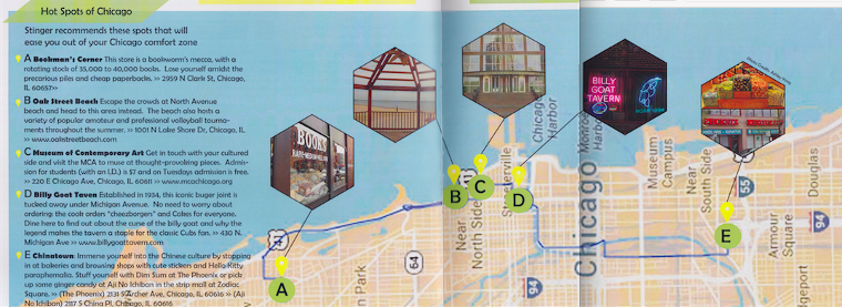
Published Info Graphic in Stinger Newsmagazine - 2014. As a part of the summer issue of the newsmagazine, I explored the nooks and crannies of Chicago to inspire students to embark on their own adventures. I realized we could have used Google Maps's images but I wanted the infographic to be as much of my work as possible.
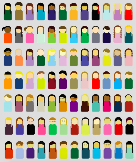
Published on http://cherubs.medill.northwestern.edu/2014/ - 2014. I graphically and accurately represented all 84 members of the 2014 Northwestern Medill-Cherubs Camp. I did not by any means have to pour hours into this, but I thought the camp members would enjoy it and it would help me master InDesign's pen tool.
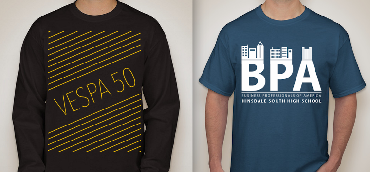
Published Vespa Yearbook shirts and Business Professionals of America shirt - 2014.
Published on http://cherubs.medill.northwestern.edu/2014/ - 2014. A graphic representation of the journalism topics explored at the NU Medill-Cherubs Camp.